Set on the Isle of Skye in Scotland a long time ago, a dwarf visits a man who knows the location of a cave far away in the mountains - a cave that contains gold to make a man rich for a lifetime. So begins the pair’s perilous quest into the darkness ahead…
I know Neil Gaiman has a LOT of female fans, legions of them who probably outnumber the male fans, so it’s going to be interesting to see their reaction to this book as the female characters - all two of them - are treated very badly.
Gail Simone’s theory of the woman in the fridge - when a female character is maimed and/or killed in order to advance a male character’s story - is very pertinent here as the death of a woman is the driving motivation behind this book. Meanwhile, the other female character is beaten and raped while our two “heroes” do their best to ignore it rather than step in. I suppose you could argue that it’s Gaiman showing the readers his narrator’s complexity as a character - that he would do so much for one female character but not for another.
Short stories really are Gaiman’s forte. His novels are uneven but I find his short story collections - Smoke and Mirrors and Fragile Things - to be outstanding and he excels in The Truth is a Cave… in crafting a story that’s part folk/fairy tale and part horror with some powerful real human moments too.
The story builds in a satisfyingly slow burn, starting in a way that feels like you know where it’s headed with some strange images popping up that, in hindsight, reveal themselves to be increasingly relevant foreshadowings as the tale unwinds so that you shouldn’t be surprised when the story takes a left turn and then another, but you are. Little moments like the dwarf running nimbly ahead of the man seem oddly magical under Gaiman’s hand while the fantastical, like what lies within the cave, seem terribly real.
The book’s genesis started when Gaiman offered to read the story at the Graphic Literary Festival in the Sydney Opera House in 2010 with artist Eddie Campbell providing pictures to be shown behind Gaiman as he read accompanied by a string quartet playing background music (I know, very… art-y!). Since then, Campbell’s added to the pictures until there were enough to create this book which is a bit like an illustrated novella, a bit like a comic, and a bit like a picture book, while never being either one!
Campbell’s painted images are very beautiful and suits the fantastical, scenic story with page after page celebrating nature and the forbidding, isolated atmosphere of the tale. He also experiments with his style to alternately shift from paint to inks to incorporating photographs into his pictures at various moments. Certain times through the story he’ll resort to comic panelling. I quite like Campbell’s art so I had no complaints about his work on this book except for one thing - the lettering in those panels.
It’s definitely true that you never notice how important lettering is in a comic until you read one which has bad lettering, and I was surprised at how poorly lettered Campbell’s panels were, especially considering his lengthy career in comics. Scratchy, shaky letters done in a spidery hand that looked rushed, they were the only aspect of this book that let the reader down.
The Truth is a Black Cave in the Black Mountains isn’t a perfect book but it is a highly compelling one. It’s an evocative story of revenge and death with fantastic paintings that lend new energy and interpretation to Gaiman’s haunting tale. His female fans may find their lips curling in disgust at times but when the story is this good, it’s hard to keep from turning the pages until you find out what happens in the end. A great horror fable from a brilliant short story writer with a terrific artistic collaborator.
The Truth Is a Cave in the Black Mountains
My third piece for Sequart went up today, and it's a review of this book. I call the article, As Human As You Want To Be, and, if you want, you can check it out here!
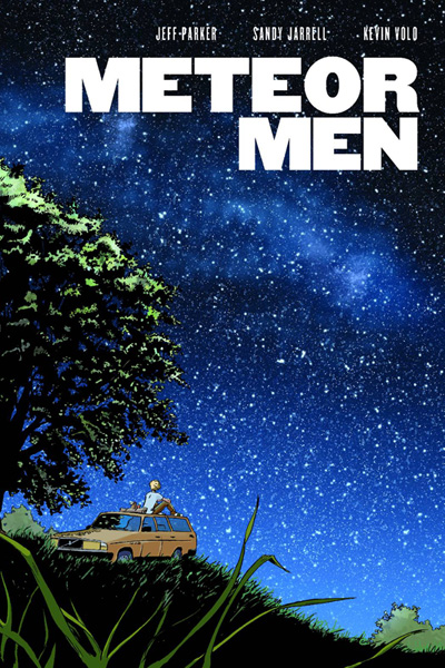
Meteors containing aliens crash on Earth. Are these extra-terrestrials peaceful or hostile? They’re actually peaceful but the US Military knows one goddamn thing – it’s got some goddamn missiles and it’s gonna goddamn use them!
As everyone freaks out about an alien invasion that isn’t happening because the aliens are too busy walking on air (literally!) as if they’re stoned superheroes who’ve just figured out their powers, one alien befriends lonely American teen Alden Baylor, a kid whose name sounds like someone with a mouthful of toffee trying to say “Alan Taylor”.
You’d think he was miserable because of his crap name, or maybe because that’s the attitude that works best on the laydees but he’s not getting any, for some reason, even though he resembles an Abercrombie & Fitch model with no parents to tell him what to do and a massive amount of land he’s just inherited, plus media attention. (That said, can a teenager own land? I don’t know the US laws but doesn’t seem right)
Middle middle middle, terrible anticlimactic ending, stare into space wondering what the point was, and it’s over.
Meteor Men is probably the least interesting aliens come to Earth storyline you’ll ever read. Our “hero” archetype, Alden, might as well have empty speech bubbles for all its worth reading his dialogue. He’s the most vacuous person to have as a main character and there should be a sign hanging around his neck saying “WARNING: Listening to me talk for any amount of time will put you a coma”.
The aliens are criminally dull too. I’m sure the idea that when aliens invade, the reader is supposed to be interested in finding out who they are and why they’re here but they do so little and display such little character – they’re like alien versions of Alden – that you’ve all but given up on them proving to be in the least bit worth knowing. I can say having read it, the reason why they do what they do is one of the most mind-numbingly boring reveals ever.
The book overall has a strong Spielberg-ian feel to it. The kid who makes friends with the alien and the government/military hunting them down cliché is very ET and the fact that the comic is aimed at younger readers makes it a very safe read. Nothing original is attempted, there are no complex themes or characters, there’s little in the way of tension or obstacles to overcome, and the message is as universally positive as you can get – don’t judge appearances and be tolerant and kind to others. A fine sentiment but bland as hell – sorry, kids – “heck”, to read.
Maybe that’s why the book has no resonance with me, being an adult reader, and teenagers will lap this up? It does seem to portray the life of a teenager fairly accurately – the awkwardness of a shy boy around girls, the parties, etc. - so perhaps for a reader going through these things themselves, they’ll identify more closely with the protagonist (who is luckily a blank slate – maybe that was the point?) and feel more strongly about the book as a result.
Sandy Jarrell’s artwork is pretty good – I liked how the alien first spoke to Alden psychically, the background was whited out with a giant word to show how big an impact it had on his mind, and overall the comic is easy on the eyes. The alien designs aren’t that original though and seem fairly generic and forgettable.
And those two words sum up Meteor Men – generic and forgettable. At no point was I engaged with any aspect of the narrative and the most powerful feeling I had when reading it was sleepiness. Maybe a teen who hasn’t read much sci-fi will enjoy this, but for the rest of us? It’s a miss. Like the meteors in the book when they lay on the ground split open, Meteor Men is quite hollow.
Meteor Men
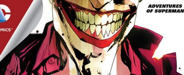
Superman’s a dividing figure for readers – there are some who like the classic character and appreciate his rich history, and there are others who think he’s boring, limited, outdated etc. Having read The Sound of One Hand Clapping #1, it seems clear Max Landis subscribes to the latter.Joker is in Metropolis, for some reason. He’s planted bombs around the city, threatening to cause catastrophic damage unless he speaks to Superman – it’s desperately important to speak to him, again, for some reason. But when Superman and Joker meet atop the Daily Planet, Joker performs a tedious monologue about why Superman sucks.Which begs the question: why does Joker want to speak to Superman in the first place - to vent his frustrations about his character to him in person? Why? Why does Joker care about Superman at all? We’re given a hint that it might be to do with identity as there’s a cute montage of the various faces of Joker over the years from Jerry Robinson’s original to versions by Brian Bolland, Jack Nicholson, Heath Ledger, etc., and Joker mentions that he’s not sure who he is - I guess this is early in Joker’s emergence as a villain? – while Superman is quite assured in who he is.He is the Joker though so he must have a semblance of identity – he has his appearance and name down, he tells jokes, he makes threats, he’s usually in Gotham fighting Batman, he’s the murder clown. So, when he resorts to (poor) insult comedy and Superman laughs, it annoys him – his humour’s not to be shared with others.No, I think it comes down to Landis hurling his own problems with Superman at the character via the mouthpiece of Joker. If you’ve heard Landis speak, it’s quite similar to the way Joker’s written here – sarcastic, weak humour delivered energetically and physically, and, I’m sure if he donned the makeup, he’d look exactly as Jock’s drawn him here.So what are Landis’ grievances with Superman? His costume is not memorable – which isn’t true as its iconic and arguably the most famous superhero outfit which defined all other superhero outfits. He doesn’t have a thing, a particular disposition – which isn’t true because he stands for peace, fights for those who need his protection, and his disposition is one of his most clearly defined qualities. He’s bland, he’s vague – and now it’s just random gripes. I’ve heard similar complaints about Superman before, I guess Landis is just better connected (his father is John Landis, the screenwriter) so he’s able to have his published in a comic. Jock’s a fine artist but he’s not given much to do here. The issue is static with Joker standing atop the Daily Planet soliloquising while Superman hovers slightly above, arms crossed, cape billowing – the classic pose. It’s almost like a play in how reductive it is. And I wasn’t that impressed with how he drew Superman in one panel where it looked like he had a jowly face, as if he’s massively overweight.Joker sums up the issue towards the end, saying that it’s been a boring conversation. I agree – why bother in the first place?
Even though it’s filled with giant toads, plant zombies, buffalotaurs, and tons of other monsters that’ll kill any and all humans they come across, I wish I could holiday in Manifest Destiny. The art team of Matthew Roberts on pencils and Owen Gieni on colours make the unsettled American frontier look so goddamn beautiful!
Lewis and Clark’s expedition has hit a snag – or an underwater arch to be more accurate. Their ship is now stuck in the middle of a river and can’t get free. Worse – as they try returning to the ship, Clark and nearly half the crew are thrown into the monster-ridden river! After they swim to nearby land, the crew becomes divided between Lewis’ group on the ship and Clark’s on the shore. Clark’s group start trying desperately to get back to the ship using zip-lines – with disastrous results. And with still more monsters are on the way, paradise is about to become blood-soaked!
You know how you survive in a horror movie? You stay together – separating only means imminent doom. And that’s exactly what’s happens to Lewis and Clark’s expedition, heightening the dramatic tension. Just as I was thinking the trip downriver was feeling a bit stale, writer Chris Dingess livens things up by dividing up the cast and putting them both in danger – a superb choice that instantly spices up the story!
After the crew suffers another loss when the rudimentary zip-line proves a no-go (in a sequence I’m not sure was supposed to be funny but made me laugh anyway!), Clark attempts to take his group’s mind off of things by sending them into the unknown forest to collect samples for Lewis and his group to examine. When you go down to the woods today, you’re in for a big surprise… that’s right, another sumptuously designed monster is waiting for them!
After daydreaming about holidaying in unspoiled monster land, I thought that Manifest Destiny would make for an amazing TV show. It’s this wonderful blend of adventure, action, fantasy, and horror with such great characters, imaginatively-created antagonists, cinematic backdrop, and a fast-moving plot with huge potential, that it would easily be a hit on AMC or HBO if either decided to pick it up and throw their support behind it. Even if they don’t though, we’ve still got these great comics, but what rich material to make a TV show out of!
Manifest Destiny #8 is another fine issue from Chris Dingess, Matthew Roberts and Owen Gieni. Part of this title’s brilliance is that while Lewis, Clark and Sacagawea are the main characters, they’re able to make the stories featuring the supporting cast as interesting because the world they’ve created that engages all of them is so enthralling. Once again, incredible art, awesome creature designs, and great work all round from these guys. Manifest Destiny continues to impress.
Manifest Destiny #8
Each week we read comics we know and love – that’s why we read them! But what about the scores of other comics that get published that we don’t read? In Journey Into Mysterious Comics, I’ll pick up a random comic I know nothing about each week and review it. Maybe I’ll strike gold and find a great new title to follow, maybe I won’t – but I live in hope!
Join me each week as we… Journey Into Mysterious Comics!
*
A man falls to his death in the middle of a city, his lungs full of water. The police are baffled – enter Cap’n Dinosaur and his partner, Honey Moon! Their investigation - finding a carnival ticket stub on the victim – leads them to Citizen Sputnik whose dastardly plans involve both giant and tiny Frankensteins and a rocket to do something dastardly.I’ve never read anything by writer Kek-W (great name!) or artist Shaky Kane, but I loved the art straight off. It’s pop art with strong lines and bright colours and the zany subject matter looks absolutely terrific given this treatment.Unfortunately the art was about the only thing I liked about this comic. It’s quirky, I liked the title and I thought it’d be a fun romp but it’s a little too knowing to really be fun. Every aspect of the writing felt like it was winking at the audience, as if it was saying “look how goofy we’re being – a detective called Cap’n Dinosaur who has a dino-helmet? And a Wolfman? AND a ton of Frankensteins?! We’re SO whacky!!!”. When something’s that obvious, it stops being fun and starts being quite wearying. Then little details started annoying me like calling the Boris Karloff-models Frankensteins, when they’re really Frankenstein’s Monsters – Frankenstein was the mad scientist. And the opening line to the comic – “A man falls from the sky. An empty sky.” What does a full sky look like?
Again, the excuse for both of those annoying details would be “hey, we’re being whacky and kerazy! You can’t take any of this seriously!!” and again that’s what’s strangely irritating about this comic. Something so self-consciously trying to be silly and out-there funny should be more subtle than out-and-out over-the-top. But that’s just my take – maybe Cap’n Dinosaur’s readers (I’m guessing this is a character who’s been around for a while) love this aspect of the character? “He’s dino-fied a Spidey line on the cover! LOL!”.Reading Cap’n Dinosaur is like someone spilled out a box of toys on the floor and threw together a story with them. “Cap’n Dinosaur and… Honey Moon… go to… the Carnevil of Crime!... and they fight… Swami Midnite! and… Muscle Mary… and tons of Frankensteins, and… Wolfman Jack and… Citizen Sputnik! Pew pew! Cap’n Dinosaur saves the day! The end”.I’d love to read more comics drawn by Shaky Kane but none written by Kek-W. Cap’n Dinosaur and the Carnevil of Crime is like Napoleon Dynamite – you’ll either like it’s brand of quirk or not. Me? Nope!
New Jersey’s own, Kamala Khan aka Ms Marvel, is out fighting the Inventor’s robots and getting ever closer to his hideout. After investigating a conspicuous hole in the middle of the street, Kamala encounters an urban myth and an unexpected hero – the girl who writes Avengers fan-fic as a hobby gets to team up with one of the greatest Avengers ever!
Right away you notice a couple of things with the beginning of the second Ms Marvel arc: 1) Adrian Alphona’s left (aww!), replaced by artist Jacob Wyatt, and 2) it’s a much more traditional Marvel superhero comic. Writer G Willow Wilson’s not hitting Kamala’s Muslim background as hard now – that was all dealt with in the first book – and has focused on the next phase in Kamala’s story: her ascendency as a superhero.
As Kamala herself notes, she’s got the “Costume. Secret hideout. Sidekick. Dastardly enemy.”, with the one ingredient missing on her superhero checklist being a theme song (which, as I write, I’m sure some talented musicians are coming up with something for her!). She’s a superhero now and what do superheroes do? Team up with other superheroes! And that’s exactly what happens in this issue as she fights some Austin Powers-style crocs with lasers on their heads (granted Doctor Evil had sharks with lasers on their heads, but it’s kinda similar), struggles to cope, and is saved by… Wolverine!
It’s an interesting choice to have Wolverine as Kamala’s first team up because he’s currently without a healing factor (I’m not entirely sure why – I don’t read the Cornell series), and, while he’s a tough guy, he does get injured and becomes something of a burden than a help. So what seems like a big boost to Kamala in her fight against the cockatoo-headed Inventor (who, rather unsubtly, is called Thomas Edison), turns out to be one more obstacle for her to overcome in her path towards becoming a greater superhero. I think it’s a brilliant move by Wilson who’s building such an amazing character in Kamala. Also, who didn’t love that panel where she fangirls out at meeting Wolverine?
Jacob Wyatt’s a fine replacement for Adrian Alphona as his artwork is lovely in its own right while also not being of the kind of flashy, supremely polished superhero art you might see in bigger titles, so the street-level/indie feel of the book is retained. And Jamie McKelvie continues to supply awesome covers – this guy is killing it right now, not just with the Ms Marvel covers but his own work over at Image on The Wicked + The Divine.
Ms Marvel’s second story arc looks to be as high quality as the first and #6 is a cracking way to kick things off.
Ms Marvel #6
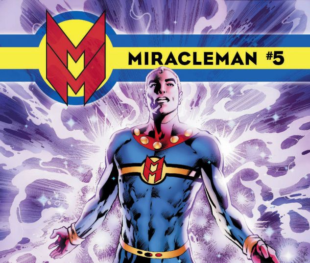
Alan Moore’s enthralling reimagining of Golden-Age superhero Miracleman continues to impress in issue #5. It’s quite a revelatory comic because it’s over 30 years old, being reprinted and re-coloured for the first time, and it still reads really freshly today.
In this issue, Mick is troubled by his wife Liz being pregnant. For years they tried to conceive and couldn’t, then he re-discovered he was Miracleman and, as the superhero, he impregnated her - she’s having his baby… sort of! A new character, Dr Emil Gargunza, appears with a vested interest in the baby and a revelation in his involvement with Miracleman’s creation.
Meanwhile, Johnny Bates, aka Kid Miracleman, is having trouble keeping the monster inside him chained up as his real identity is being taunted by this powerful other voice, the evil Kid Miracleman. The issue closes with a wonderful silent short starring Young Miracleman as he tries to impress a lady.
The re-mastered art looks terrific and Alan Davis’ work on Mick really shows up the contrast between him and his alter ego – Mick is flabby, with a gut, wrinkles, and loosening skin around his face, while Miracleman is an Adonis! I also really liked the silent issue where John Ridgway’s art tells the story - it was a simple tale, told really perfectly and was a really enjoyably light way to close the issue.
Story-wise, it was a bit contrived that Miracleman was in the park doing nothing when his wife was being kidnapped because if he had been at home, he would’ve easily stopped it. As it was, Moore placed him in the park so that the storyline could advance, not because he really needed to be there to impress some random kid. Otherwise, great writing from Moore.
This issue came sealed and usually that’s because it contains adult material that the casual kid browser in a comics store legally shouldn’t see, but there’s really nothing bad in this issue. There’s a sex scene between Miracleman and Liz but you don’t see anything - maybe Marvel just want to stop any cheapskates from reading the comic for free in store rather than buy it? I suppose some swears do appear, but come on, aren’t we past a few fucks these days?
Also, I’m not sure about you but I don’t need to see any more extras. I don’t need artist sketches or pages from how the comic looked prior to the remastering, and I don’t need to read the reprinted ‘50s comics. I’d prefer if they dropped these, lowered the price point, and focused on the Moore stuff because that’s what we’re reading it for isn’t it?
Miracleman #5 is another excellent comic in this series with great writing and wonderful artwork throughout. It’s a fine start to the second Miracleman story arc, The Red King Syndrome, and I’m looking forward to “Moore” (sorry, couldn’t resist!).
Miracleman #5
In The Wicked + The Divine, Kieron Gillen gives new meaning to the term “rock gods”!
Every 90 years twelve gods return to Earth as young people for 2 years and then die. This time around, they’re all music stars - rockers, rappers, popstars - and someone is out to kill them. Luci (short for Lucifer) foils the assassination attempt against her and her pals in the first issue but she was arrested. In the dock, it looks like she kills the judge by snapping her fingers - but she claims it wasn’t her.
In this second issue, Laura, a huge fangirl and our heroine, must help bring the other gods to Luci and get her out. With the help of the cynical journo from the first issue, she gets enough information to track down someone called The Morrigan who’s performing at an abandoned underground station at night.
I’m loving this series! It’s not the most action-packed title but there’s lots of great characters and wonderful interactions between them, which is what I prefer anyway. Luci’s still delightful - I’m getting a strong Loki vibe from her - and her origin story is made epic by Jamie McKelvie. Look for that awesome double splash page of her fall from ordinary girl to Luci drawn biblically epic as she literally goes through a baptism of fire!
And that’s what makes this series stand out so much - Gillen’s script is great, his dialogue is acerbic, crackling, and witty as ever, but McKelvie’s interpretation of it on the page really elevates it from good to incredible. He makes perfect use of light and dark so that the subway sequence is perfectly balanced. First a wide panel to establish the scene, then pitch darkness with captions, then slowly more light so you can make out the escalator down, then the platform below, then the tunnel where the issue ends. He uses space so beautifully in his layouts that even the absence of his art makes the comic look more stylish than ever! And the series covers are so gorgeous - they better be made into posters because I want every single one to hang on my walls!
I mentioned in my review of the first issue that Gillen reminded me of an amazing forgotten song - I Saw Her Standing There by The Beatles - and he does it again with #2. Celebrity Skin by Hole, a song I haven’t listened to in ages, suddenly becomes the soundtrack to this issue and it couldn’t be more suited.
The first issue was a great start, but this second issue is even better - Gillen and McKelvie are both on top form and it’s utterly magical to read. The Wicked + The Divine, guys - this is the best new Image series being published right now, and I can’t say enough good things about it. Check it out!
The Wicked + The Divine #2
Strangely, not a whole lot happens in this issue to advance the threadbare plot even though we’re closing in fast to the finale. Fury continues to look guilty as hell, some more of the cards are on the table, and the heroes are standing around waiting for something to do. Meanwhile, Midas (who looks exactly like The Thing - is he supposed to?!) and co. are wandering about for some reason. And that’s the whole issue.
I think I know why I’m not enjoying Original Sin and it’s two things. First, because it’s essentially a police procedural and I hate that genre. Characters potter about in labs, going to crime scenes looking for clues, standing in front of screens or boards with post-its pinned on them, stroking their chins, pondering… it couldn’t be more boring, at least to me.
And second, because of Aaron’s snail-pace plot. There are two exciting moments in a murder mystery - first is the murder, second is the hunt for, and apprehension of, the killer. The initial murder was kinda interesting but the hunt for the killer has been mostly a snoozefest. At this point in the series - #6 out of #8 - there really should be an elevation of tension or a feeling of momentum being gained, and there really isn’t.
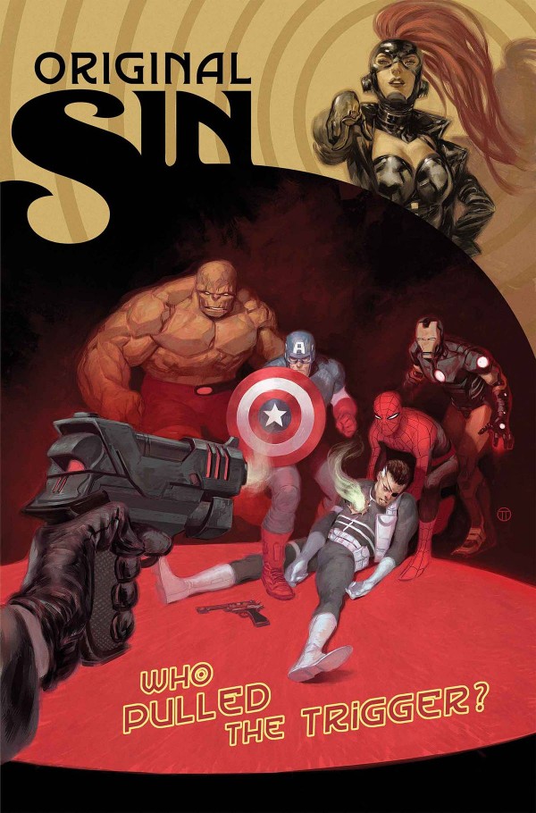
We find out why Fury’s suddenly really old, the heroes have a pointless big fight, and then the final page is supposed to make us excited for the next issue but instead made me feel otherwise. And while the cover seems interesting, if you’ve been following the series so far, you’ll know better - and the question, Who Pulled the Trigger?, becomes such a pointless one, really.
Mike Deodato’s art is still terrific and, with each issue that passes, I become more of a fan of his style. He can do big action splash pages really nicely with lots of detail to give it this wonderful HD appearance, and I love how he draws the characters so that they just look badass. There’s still too much ink on the page though - the comic looks great but it’s a bit too dark.
Original Sin is turning out to be a very unremarkable murder mystery though it’s spin off books are generating more interest - Thor and Loki’s sister, Stark’s involvement in Hulk’s creation - so maybe while the main title becomes less and less interesting by the issue, the spinoffs are the comics to be reading? Either way, Original Sin #6 is quite a dull comic with Jason Aaron content to continue treading water for another issue and bore the reader still further in the process.
Original Sin #6
Fuuuuuuuuuuuuuuuuuuucking hell. Am I glad THAT’S over with!
It took me over a month to read this final book. I would pick it up, read a page or two, then put it back down, thoroughly dejected. Some days I would open it up, stare at the page for a moment not reading, barely seeing, and put it back down again. Finally this weekend, I forced myself to get through this so I no longer have to stare at it staring back at me on my desk and so I can say that I’ve read the complete Invisibles series.
Well, I’ve finished it now - but I don’t think it was worth it.
I’d normally try to write a summary of the book and try to contextualise it before the review but, flicking through it once more, there’s no point - I have no idea what happened in this book other than the series ended. Actually I just came across one panel that perfectly sums up the series: a “character” is taking pictures of a toilet and calling it the Holy Grail. The Invisibles is a critically acclaimed piece of crap!
Usually by the end of a series, there’s been a storyline building up and you’re looking forward to its resolution but to be honest I’ve never really known what The Invisibles is about. The Invisibles are some abstract terrorist cell fighting conspiracies across the world that happen to be real and in this one they’re supposed to stop the coronation of a monster from another dimension who’s going to be King of England or something. Which they do in about 40 pages of brain-mashing nonsense. So what happens in the remaining 250 pages?
Weeeeell… there’s about 100 pages of gibberish as the various members of The Invisibles train (doing karate, flying jets, doing drugs) while Sir Miles (the villain) is tied to a chair in a windmill (or a time machine) and goes through some weird mental conditioning.
These first 100 pages meant nothing to me. What flying a jet had to do with anything went totally over my head, especially as it has nothing to do with the rest of the book. Doing karate and practicing martial arts? They never use either. Mental conditioning Sir Miles? Useless because he’s some kind of next-level Mason who can withstand the conditioning. So why allow The Invisibles to do this in the first place? It wastes his time, it wastes their time (granted they don’t know it’s wasting their time), it wastes the reader’s time, and neither The Invisibles or Sir Miles learn anything useful. So this first 100 pages is just Grant Morrison wasting everyone’s time, showing us, once again, how learned he is by cramming in reference after reference to all aspects of culture. It’s not interesting, it’s hella boring.
The next 100 pages follows the most tedious “character” in the series, Edith, an old flapper from the 1920s who’s now 99 years old and dying. She was once King Mob’s lover and they spend 100 pages being pretentious together, talking about philosophy and what happens when you die. I honestly just wanted to throw the book away rather than suffer through these issues.
By the way I’m putting the word character in quotation marks because at no point do any of these people feel remotely real. They all sound exactly the same, they all talk the same pseudo-philosophical/spiritual crap, and they’re all flat as pancakes. They also just drop in and out of the story for no reason. Most of the book takes place in England but characters from America and the rest of the world appear out of nowhere and then disappear just as abruptly.
So that covers 240 pages of this 290 page book - the remaining 50 pages, I have absolutely no idea. It’s the end of the world or something and I couldn’t understand a single fucking caption or piece of dialogue. And then it ends with Jack talking to the reader to basically wake up. Good thing too as I’d read these last 50 pages completely numb.
Can you see why it took me over a month to get through this turgid rubbish? By this seventh volume, The Invisibles has ceased to be a comic with any narrative, characters, etc. and has become a bizarre pamphlet where Morrison can spew out his thoughts on this, that and everything. It’s so self-indulgent, it’s unbelievable.
The only reason I’m giving it more than one star is because of the remarkable roster of artists assembled for this final, bloated hurrah - from Frank Quitely to Sean Phillips, Philip Bond to Chris Weston, Cameron Stewart to Jill Thompson, and about 10 other artists, I loved most of the art in this book and was quite often the one thing keeping me going. I was surprised not to see Phil JImenez contribute though, seeing as he’s drawn the majority of this series.
I’m actually a really big fan of Morrison’s work which is why I forced myself through the whole series even though, if I’m being honest, I stopped enjoying it after the first volume! I kept hoping - and other fans of the series kept telling me - that it would get better, it would start making sense, and so on, but it just happened, for me anyway. I’m not saying anyone who likes this series is wrong but for whatever reason it just never clicked for me. But I can see why there have been books written about The Invisibles because, if nothing else, Morrison has crammed all kinds of strange ideas and theories into this title, so there’s a lot of rich material to extrapolate and ponder upon.
The only problem with that approach is that it’s extremely boring to read - replacing things like narrative and characters with half-baked ideas, druggy visions, and an incoherent, experimental style to communicating them that’s almost anti-sober-reader just alienates the audience, as they can’t figure out what the hell is happening.
When you put no effort into creating characters, the reader won’t care about them; when you put no effort into the story, there’s no narrative tension or drive to interest the reader; Morrison just heaps reference upon reference of esoteric stuff that unless the reader is already interested in them, like his views on the Kabbalah or whatever, you’re not going to be remotely engaged with the book.
If The Invisibles is anything, it’s an extended display of Morrison stroking his own ego in front of an audience for seven lengthy books. And it goes from being dull to read, to annoying, and finally exhausting. I’ll re-read other Morrison books but I’ll never come back to The Invisibles.
It’s done - MY sentence is up.
.
The Invisibles, Volume 7: The Invisible Kingdom
A man saves New York City with maths.
How awesome does that sound? Don’t bother reading this review - find it and read it now! It’s outstanding, I promise!
Heller Wilson’s writing his PhD thesis and decides to use the theories of disgraced mathematician, Dr Spencer Brownfield, which throws his chances of getting a doctorate out the window. But the more he learns of Brownfield’s ideas, the more he realises how brilliant he is. Using the same principle as the Butterfly Effect (a butterfly flaps its wings on one side of the world, a hurricane appears on the other), the two make small actions in specific areas of NYC at specific times to keep the city from imploding. But a perfect storm is gathering to destroy the city - can Heller rise to the challenge or will the city finally fall?
So many times in comics NYC gets saved by colourful superheroes in tights with powers and, yes, that’s because Avengers Tower is in the heart of Manhattan (for some reason - why paint a target on a densely populated area ripe for multiple casualties, especially as it gets attacked so often?), but when have you ever read a comic where an ordinary academic dude uses maths to save the city from destruction?
It is a bit like a superhero story because of the student being recruited by the aging master to act as guardian to the city, whose identity will never be known to the public, and who uses special mathematical algorithms (“powers”) to keep the city going, save lives, etc. The structure is quite similar, but it’s much more exciting than reading, say, Spider-Man as no characters’ existence is assured and none have any superpowers to protect or help them.
Charles Soule is one of the most remarkable comics writers to emerge in recent years. He’s currently writing Swamp Thing, Superman/Wonder Woman and Red Lanterns for DC, as well as She-Hulk, Inhuman and the forthcoming heavily-hyped mini-series, The Death of Wolverine (he was also writing Thunderbolts but has now left the title). Not content writing that many comics per month, he’s also writing Letter 44 for Oni - the man is a freakin’ machine!!
Not only is his output prodigious, but those comics are actually quite good. However, I would say his best work is in the indie fields - Strongman was great, Letter 44 is terrific, and Strange Attractors from Archaia? It’s my favourite Charles Soule book yet. To take this kind of high concept story with unknown nerdy bookish types as the leads and turn it into this unstoppable thriller takes a special kind of talent. It’s no wonder the Marvel and DC editors read this and thought “we need to hire this guy”.
Greg Scott’s photo-realistic art is stunningly beautiful. The panels are so detailed that even if you’ve never been to NYC, you’ll feel you have once you finish reading. There’s a clear love of the place from both creators as they take the reader on a tour of the world’s most famous city. Special mention has to be made to Robert Saywitz who designed the Complexity Maps that Heller and Spencer create to figure out where the trouble-spots will be ahead of time. They look like modern art sculptures on the page and they differ from when they’re the hand-drawn type in Spencer’s notebooks to the computer-generated type Heller creates. They’re just so awesome!
Strange Attractors was an amazing read. I got so drawn into it that I found myself barrelling through it much too quickly so I had to pace myself. Only read a few pages a day - it’s not often I read a comic this good and I wanted to savour it! - so it took me about a week to get through, though I could’ve gobbled the whole thing down in a single sitting easily.
It’s a fantastic, original story that’ll have you gripped from start to finish and it’s really well-written with one hell of an art team. Strange Attractors is the whole package - don’t miss it!
Strange Attractors
The Auteur is a comic that desperately wants to be funny and satirical and fails at both.
Nathan T. Rex is a hot Hollywood producer whose films have been enormously successful. Except for his latest movie, Cosmos, which is the first in a trilogy of movies already filmed and costing the studio half a billion dollars - Cosmos is flopping and T. Rex needs a hit soon to restore his rep. So he stumbles across a pitch for President’s Day, a slasher flick with Abe Lincoln as the killer, but it’s not enough - the movie needs to be stand out, so he hires a real serial killer as his murder consultant. And then things really go off the rails…
I’m a big Warren Ellis fan and loved his and Darick Robertson’s Vertigo series, Transmetropolitan. If you’ve read those books, you too might notice quite a resemblance between T. Rex’s personality and Spider Jerusalem’s. They’re both drug-taking loons whose moods go up and down like a roller coaster as they barrel through their chaotic lives.
But while Spider’s story had a whiff of nobility (among other things) as he was an outlaw journo taking down a corrupt presidency, T. Rex is just a hack producer who wants to get with a big-bottomed woman. Seriously - that’s his motivation for the entire book. He sees a “big black ass” (his words) and the story goes from being about a serial killer on the set of a slasher movie actually killing the actors, to becoming the most pitiful excuse for a love story - no, it’s a lust story - ever. At no point are you rooting for this unpleasant man or hoping he gets anywhere near the “bubble butt” of his dreams.
Unpleasant is a good word to describe the “humour” of this book. One of the issues opens with T. Rex’s analysis of the various kinds of boobs women have - sides split yet? Or the howler when he spikes his “love interest”’s drink with hallucinogenics (why did she give him another chance after that again?). How about that the book starts with him metaphorically swimming through the waters of creativity (he’s actually on drugs) looking for something “deep” and “meaningful” and only coming up with a different president to be the killer - geddit, he’s parodying Hollywood’s lack of ideas! And that’s another thing - can you satirise Hollywood anymore? It’s basically become it’s own joke, hasn’t it? Talk about low hanging fruit.
James Callahan’s art is quite good. It’s high level of detail reminded me of the great Geof Darrow’s work and Luigi Anderson’s bright colours were well suited to the druggy, hallucinatory scenes. And I do like the energy of the comic, it’s just such a shame that the main character is someone you immediately hate and then go on to loathe.
The film industry often produces shallow, boring, artless crap so it’s ironic that The Auteur itself becomes the very thing it wanted, and failed, to satirise.
The Auteur
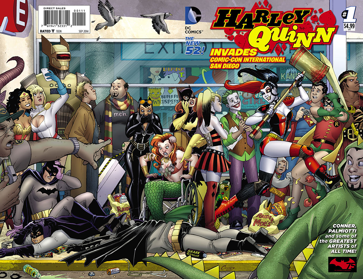
Harley Quinn #0 was one of my favourite single issues of last year. It contained a multitude of artists drawing single pages as Harley, in a sugar coma after binging on junk food, dreams herself in a variety of costumes and situations. Though I’ve stopped reading the series as it’s gotten progressively less brilliant since that issue (that Sy Borg story was the last straw!), I picked up Harley Quinn Invades Comic-Con International #1 because I was hoping it’d be as fun and creative as Harley Quinn #0. It’s got lots of artists, it’s meta, it should be great, right? It should be – but unfortunately isn’t.
Much like the Con itself, Harley Quinn Invades Comic-Con International #1 is a chaotic blend of references and scenes smooshed together in an oversize space. The threadbare plot sees Harley helping out her Coney Island tenants selling… merch(?) for some reason, and then she tries to get her comics work commissioned by a famous editor and land herself a gig as a professional comics artist. “Hilarity” ensues.
First of all, her tenants do some weird fetish carny sideshow in Coney Island – why would they feel a presence at Comic-Con would be necessary? Amanda Conner and Jimmy Palmiotti should just throw Harley at the Con, without the pretence of a plot, because this whole issue is a gimmick and it’s not supposed to make sense – embrace that, maybe even acknowledge it! Second, since when has Harley been a comics creator and harboured a desire to be published? Oh, since the start of this issue. Well, that’s certainly not contrived!
But like I said, any semblance of a plot seems unnecessary as it’s secondary to Harley running around being Harley. She de-pantses a Batman cosplayer, she goes for a joyride in a limo with a gang of Harley cosplayers, and she meets one DC exec after another in a series of bizarrely corporate cameos. Hmm, this last one – did anyone want to see Dan DiDio appear in a comic? Because I sure didn’t!
And that’s what’s weird about this comic: while you initially get a sense of the crazy, overwhelming nature of Comic-Con, rather than spend time referencing the Con itself or exploring its myriad aspects, it basically becomes a spot-the-DC-employee issue which isn’t funny or interesting to anyone outside of DC or those who know and care about these people. The issue’s blurb mentions that Harley battles “con crud” but she doesn’t because it isn’t really about the Con. She does meet her creators Paul Dini and Bruce Timm though! It was a nice cameo but quite unimaginative – she just asks for their autographs when I feel that if Dini were writing this issue, he’d have Harley cave their heads in with the mallet or humiliate them or something. The flattery/hero worship thing seemed too polite and dull.
“Quite unimaginative” basically covers all of the scenes in this issue. Harley hijacking a limo with some Harley cosplayers, then shooting a cop in the ass was just… meh. Not to mention really dumb in how it played out. So Harley futzes with the limo driver so much that he stops the limo – and then abandons it! No limo driver would ever do that! Then, down at the police station, the cops let the gang of Harleys go because they can’t get a positive ID on the shooter. That was beyond stupid. It was cool to see the various incarnations of Harley lined up though.
By far the best part of the issue was Harley’s comic, Hurl Girl, drawn by Conner, whose toxic barf saves the world. But I wasn’t sure what the point was – are we supposed to think Harley’s a good or bad comics creator? Because the other characters look upon her work as terrible and it’s actually quite decent!
This issue goes on FOREVER! It’s an extra-long issue and it feels even longer because the Harley’s antics become so tiresome so soon and the jokes are so unfunny. Like when a mob appears around a famous actor who we don’t see (except for Stephen Amell, star of Arrow, who gets a cameo) and then Harley walks by quipping that she loves that person. Yeah, hilarious, guys. It’s so exhausting to get through, I actually stopped halfway through, went and read something else, and finished the second half the following day.
The worst part of the issue was the implication that Harley… did… stuff… to a room full of Jokers. That scene alone makes me glad I dropped the title as this one-shot shows the series has taken a sharp drop in quality – and just in time as DC decides to double-ship this title!
Harley Quinn Invades Comic-Con #1 tries unsuccessfully to replicate the brilliance of Harley Quinn #0, and instead comes off as bloated, thrown-together, uninspired and really, really boring. There are some nice moments here and there like the Hurl Girl short and Harley riding the ’66 Batmobile, but generally it feels like a missed opportunity and, worse, an example of DC’s hierarchy having their ego’s massaged by one of their characters for all the public to see!
Ick.
Harley Quinn Invades Comic-Con International #1